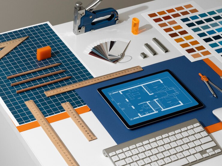
In graphic design, it is essential to have a structure and organization; it is hardly possible to overestimate their importance when designing good-looking and efficient designs. Among these, the grid systems are the most straightforward approaches for attaining this goal. In graphic design, the Grid is like an invisible structure on top of which elements are placed to align them into a recognizable pattern. In this article, we focus on Grid Systems, their background, classifications, and how to use them to produce attractive graphic designs.
What is the meaning of Grid systems in Graphic Design?

Axis in graphic design is called grid systems, a set of horizontal and vertical lines that guide the placement of objects on a page or a screen. These grids assist the designers in positioning images, texts, and other features harmonized and symmetrically to create a united look. Through a structure, a grid makes it possible to lay out various aspects within a design in a harmonized manner and professionally. In general, grid systems are beneficial in the design process, especially when creating layouts for both print and web-based applications.
The History of Grid Systems
The use of grids in design has been practiced since ancient times. It can be observed in the works of manuscripts of the primitive period, where artists aligned texts and pictures using grid systems. However, more to the point, the more recent use of grid systems in graphic design started in the mid-century, specifically with the rise of the famous Swiss design. Designers from Switzerland, such as Josef Müller-Brockmann and Jan Tschichold, were some of the pioneers who introduced grid-based design. They said that a vital structure that resulted from the application of the grid systems in the design of communication materials enhanced the effectiveness of the communication and had a better aesthetic appeal.
Why Use Grid Systems?
The employment of grid systems in graphic design has several advantages. Here are a few key reasons why designers rely on grids:
1. Consistency and Balance
Margins ensure that all the objects on a give are vertically or horizontally aligned. This results in creating balanced designs; no single design feature dominates the other; there is harmony.
2. Improved Readability
Properly coordinated organization of layouts in terms of grids helps readers to go through the content effectively. In a magazine, on a website, or even in a brochure context, it is easier to sort out the information into grids.
3. Efficient Design Process
Grids are effective because they act like a guide that doesn’t require the designer to waste time trying to organize visual components. When a grid system has been implemented, a designer can determine the placement of text, images, and other related parts without much stress.
4. Flexibility in Design
As much as they offer structure to images, mainly through alignment, grid systems in graphic design are flexible. There is, however, flexibility in using the Grid, and designers can get rid of it where necessary to introduce emphasis or a point of focus.
Types of Grid Systems

Various grids can be applied in their designs according to the project’s requirements. Some of the most common types include:
1. Manuscript Grids
Manuscript grids are the most basic types, with only one large rectangular shape to contain the content. Such a grid is often applied to continuous text areas, to works such as books or articles.
2. Column Grids
Page and column grid structures cut the specific page into columns to orderly arrange the text, images, etc. This kind of Grid is common in newspapers, magazines, and websites. There are options for changing the number of columns and the gap width between them, making for a more exciting design.
3. Modular Grids
Modular grids contain vertical and horizontal lines, meaning they comprise a matrix of modules. This is an extended type of grid system that is usually appropriate for more complex layouts of elements, as found in websites with interactivity and many shopping carts. They can accommodate distinct components, and every module’s layout can be adjusted to provide a higher degree of specific detail.
4. Baseline Grids
The primary purpose of baseline grids is to establish text alignment. They are a series of horizontal lines that ensure the text data aligns decently across the columns. Baseline grids are mainly applied in the print design because the space between the lines has to be consistent.
5. Hierarchical Grids
Hierarchical grids differ from any other type because they are more free-form than most. They are generally applied to layouts that require the positioning of objects based on their relevance, not their order. This approach is ideal since it can be more dynamic in design for art or portfolio websites.
How To Apply Grid Systems in Graphic Design

Designing with a grid is simple but requires some planning when undertaking a design project. Here’s a step-by-step guide on how to incorporate grids effectively:
1. Understand the purpose of the design
Knowing the nature of the content you align with a given grid is essential before selecting the Grid. Is it a wordy article, or is it an image-filled booklet? Knowing the use of the design shall assist you in deciding which grid system to use.
2. Choose the Right Grid
Choose a grid to employ that meets the design requirements in question. For instance, one may choose a column grid while doing a magazine layout. Alternatively, you can use a modular structure for the fixed Grid.
3. Set Up the Grid Framework
In design software, one can create grid systems by setting guidelines. Almost all programs, such as Adobe InDesign and Photoshop, have provisions for creating grids. It is also possible to set the number of columns, rows, and gutters depending on the general concept of any design.
4. Align Elements to the Grid
When you populate the page with content, try to make sure that this content is aligned with the grid lines. Consistent alignment is good for avoiding the cluttered look.
5. Be Creative
So, even if a framework is given through a grid, web designers should not be restricted to it. Getting away from the Grid to highlight specific items is perfectly okay. Sometimes, it is helpful to question the Grid; sometimes, it is beneficial to heed it.
Real-life applications of Grid Systems
To better understand how grid systems work, let’s look at a few real-world examples:
1. Print Media
The most suited applications to what grid systems are magazines and newspapers. Articles are always arranged in multiple columns, and images and captions conform to these grids for optimal readability and visuals.
2. Web Design
Used in web design, grids help in the development of structures that are responsive in nature. Websites displayed on various screens depend on the grids to achieve uniformity. Bootstrap, for instance, has a 12-column grid layout that designers can use to gain more flexibility when developing web pages.
3. Posters and Brochures
The main idea of the posters is best expressed through the elements of the hierarchical grids. Even if the body is aligned in a very tight grid, one has to experiment with fonts and images to have a focal point, thus making the poster enjoyable.
The Significance of Grid Structures in Current Design

This means that in modern design, grid systems are not just principles and tools; they are concepts. The evolution of new media technologies has only increased the importance of grids as flexible layouts for digital media. Due to the grid-based design frameworks, it becomes easy to develop layouts that could be responsive and thus fit in with different devices.
Common Mistakes to Avoid
Using grid systems in graphic design is helpful, but the misuse leads to messy and complicated interface designs. Here are a few mistakes to avoid:
1. Overcomplicating the Grid
Having many columns or add-ons may make a design look clunky. The arrangement of specific amounts of order and freedom is also crucial in designing a learning environment.
2. Ignoring Consistent Alignment
When some items are not correctly aligned to the Grid, one wonders about the rationale behind using a grid in the first place. If all components follow the grid lines, the design will be clean.
3. Being Too Rigid
A grid is a guide and not a rule of a game. The layout appears mechanical when a grid is followed by a letter. So yes, allowing some level of flexibility for creativity is manageable.
Conclusion
Graphic design grid systems are essential resources crucial in any graphic design work to introduce order, harmony, and a good look. For graphic designers working on print or electronic media, a well-laid-out grid can bring a lot of ease to the designing process, making the material easy to comprehend and visually appealing. The tutorial gives a clear guide on the various kinds of grids and how to apply them so that a layout can be both formal and artistic to draw the eye of the viewer. It is revealed that grids can work behind the scenes and, at the same time, strongly influence the results of design processes.


